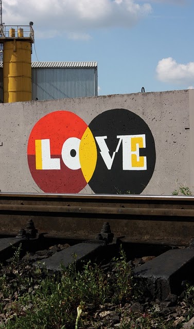
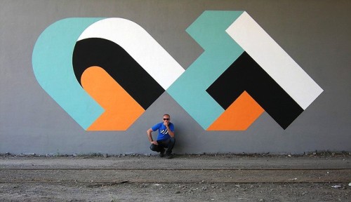
Sometimes the best design inspiration can stem from what we pass on the streets, painted and stenciled onto walls by our nocturnal and mysterious counterparts. What we find is that street artists use many of the same spatial and graphic elements that designers use in creating their work. Here are some examples of excellent typographic designs by famous street artists D*face, Mobstr, Aske, and CT, for inspiration.
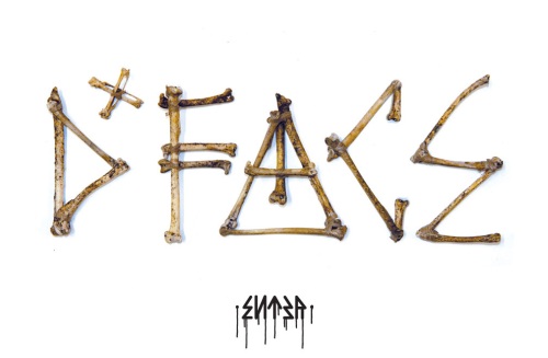
D*face
D*face is most known for his logo-like stickers and cartoonish pictures, but shows he’s also capable of creating his own typography.
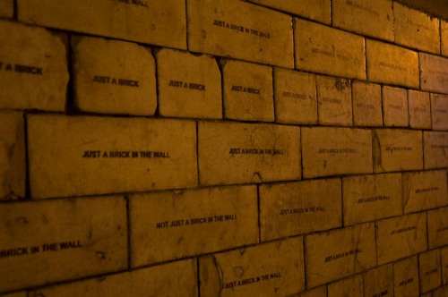
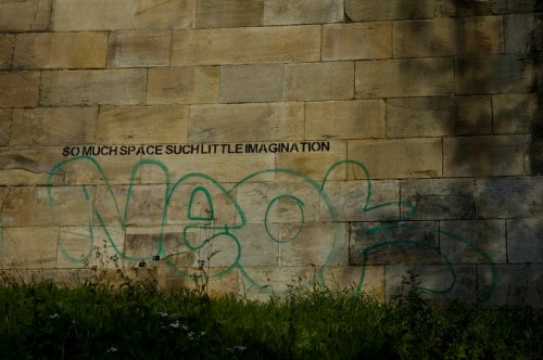
Mobstr
Mobstr’s pieces usually consist of simple, black stenciled quips — which only make his jokes funnier in their context. He shows typography doesn’t need to be fancy to be clever.
Aske
Russian artist Aske (meaning “Ashes” in Norwegian) chose the name because he liked the shape and flow of the letters. He employs graphic elements similar to that seen in 1950s and 60s designs.
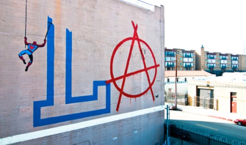
CT
Russian artist CT employs elements of movement, geometry, and optical illusions to create extremely bold and striking pieces, which appear more like logos than graffiti.


