Monthly Archives: September 2011

Cabernet, Chardonnay and Geothermal Power – Finger Lakes Wine Country “LEEDing” the Way

By REA Project Manager Ellen Bonalsky

I recently spent a few days in the Finger Lakes region of our country.  For those of you who are unfamiliar, the Finger Lakes are a pattern of 11 lakes in the west-central section of Upstate New York — about a 5-hour drive from the New York City area.  Early map makers who drew this region nicknamed this region the “Finger Lakes” since each lake has a long and thin shape to it.  During my visit I spent time on one of the largest lakes — Seneca Lake — which is 40 miles end to end and 3.5 miles wide.

There are over 100 wineries in the Finger Lakes Wine Country based on the “lake effect” climate being ideal to support lush vineyards.  The grapes are protected from the first frost of the winter, since the lake retains the residual summer warmth, and are also immune from the spring frosts that can occur, as it carries over the winter cool into spring.  The main grape varieties grown in this region are Chardonnay, Riesling, Pinot Noir, Cabernet Franc and many Vitis labrusca, which are American Native grapes, aka the fox grape.  Seneca Lake is home to 34 of the above mentioned wineries.

One of the wineries on Seneca Lake that caught my attention ahead of the rest was the Red Tail Ridge Winery.  They are written up as being “LEED Gold Certified.”  At first I thought I was having trouble disconnecting from work, as we constantly partner with our clients to smartly highlight their LEED Gold status in marketing materials (should they be fortunate enough to have reached this benchmark).  But as I investigated further I realized this winery was savvy, cutting-edge and put their best foot forward for the environment.

The LEED Gold certification was announced in early 2011 — and it is the first LEED Gold certified winery in New York State.  The owners said they faced the small business dilemma that many other industries face – which is the challenge of fiscal reality and balance with their environmental ideals.  They were lucky enough to find themselves in a win/win situation — they could be “green” and save over 50% in energy consumption.  Red Tail Ridge’s LEED Gold certification was based on a number of their green design and construction features that positively impacted the project and the broader community.  They partnered with Edge Architecture PLLC, from Rochester, NY for the building design, Chrisanntha Construction as general contractor and the LEED commissioning agent was Halco.  Here is the specific list of what the full team did in order to achieve LEED Gold status:

  • All heating/cooling requirements for wine processing is provided by geothermal energy
  • The building was constructed from recycled materials
  • All winery processing waste is recycled
  • Natural lighting in winery eliminates need for artificial lighting during the daytime
  • Low energy light fixtures are used throughout the winery
  • 70% of total wood based building materials were harvested from FSC certified forests

Robert Mondavi once said, “Making good wine is a skill.  Fine wine is an art.”  I would like to personally ‘Salute!’  Red Tail Ridge Winery in Penn Yan, NY for creating an “art” that we can all feel good about when consuming.

Ellen Bonalsky is a project manager at the branding and digital marketing agency REA also known as Real Estate Arts.


At One With Nature (Design By Nature)

By REA Intern Jess Wertheim

Frank Lloyd Wright, America’s beloved and arguably most famous architect, took the concept of “being at one with nature” to a whole new level when he built Fallingwater.  Inspired by nature, Wright built amongst it. Fallingwater is a home that Wright designed and built over a 30’ waterfall between 1936 and 1939 for the Kauffman family. It has become a National Historic Landmark.

Located in southwestern Pennsylvania, the home straddles a 30-foot waterfall on Bear Run in the Laurel Highlands of the Allegheny Mountains.  Wright wanted the family to live intimately with the fall — where they could see it, hear it, and feel it around them all the time.  The attention to space, focus, and the harmonious relationship between man and nature reflects the strong influence of Japanese architecture on Wright.

Wright successfully incorporated the home’s natural surroundings.  Observing the structure and standing inside it, one feels a part of nature and home.  This integration is felt, for example, in the living room: one can watch as the water flows away through a huge glass window on the floor; the fireplace is built from boulders selected from the site; and ledge rock protrudes into the living room in order to link the outdoors with the indoors.  A pool is formed one floor below, and a natural shower uses the mountain water from the fall another floor below.  In windows and walls where glass meets stone, the absence of metal frames adds to the natural, organic feel of the home.

The soothing sound of water fills the house, the vivacious forest blows in the wind, the rocky boulders jut out from the falling water, and the occupant is at one with nature.

Photos on 9/11

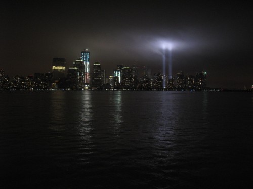
REA Designer Anthony “Chip” Fernandez snapped some shots of lower Manhattan on the night of September 11, 2011.  These photos capture the two rows of lights beaming from the ground up from the World Trade Center site, piercing the Manhattan skyline and illuminating the cloudy sky.  He took them with a Canon G10 on an auto setting with no flash.  These were taken from Exchange Place in Jersey City.

Real Estate Arts designer Chip Fernandez masterfully captures a 9/11 moment

Real Estate Arts designer Chip Fernandez masterfully captures a 9/11 moment

Real Estate Arts designer Chip Fernandez brilliantly captures a 9/11 moment.

Real Estate Arts designer Chip Fernandez brilliantly captures a 9/11 moment.

Real Estate Arts Designer Anthony "Chip" Fernandez snapped some shots of lower Manhattan on the night of September 11, 2011

Real Estate Arts designer Chip Fernandez perfectly captures a 9/11 moment.

The World Financial Center: REA Design Process

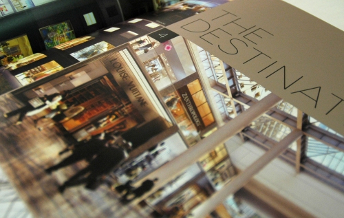
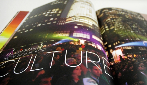
REA Director of Design Irasema Rivera called her very first project at REA “a progressive challenge” — in the most positive of terms.  The World Financial Center’s design process — from the initial look and feel to the printed piece — took the creative team about 2 months to complete.  Under Rivera’s guidance, they created a vision that would highlight the three major qualities of this new development: the high-end retail, excellent accessibility, and regrowth of this post 9/11 neighborhood.

Irasema: The retail was envisioned to be high-end, a completely new retail experience for the consumer, different from how they may be experiencing it today.  So we went for a look that would bring in that sense of fashionable, luxurious retail throughout the design.  The second piece was the accessibility–that the WFC would be extremely easy to get to due to the addition of the West Street entrance, as well as the new Fulton Street Transit hub.

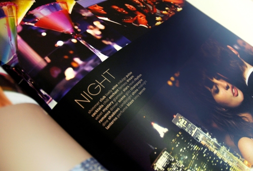
Last but not least, there was the neighborhood–an area that was blooming again in the decade following 9/11.  A project like WFC was proof that businesses as well as residents were committed to bringing the neighborhood back, and expanding upon it.  So we focused on images and phrases that would really highlight what the WFC had to offer throughout the day and also at night… from beautiful scenery and a great neighborhood for business, to the dazzling nightlife of clubs and restaurants.

The inspiration for the logo came, in part, from the idea that the WFC was painting a new vision for itself — one that included a curated, considered experience — similar to something one would experience in an art gallery. Since the World Financial Center is near the water, I thought that the brush strokes of a water color painting would work for the logo. I did an initial set of drawings on tracing paper using a wide marker. After about the third one, I knew we had it … but we did another 20-30 just to be certain. Once selected, we scanned the drawing and then converted it to vector outline artwork in Illustrator.

The Land Of Wood, Water … and Windmills?

By Lori Llewellyn, Director of Human Resources

Anyone that knows me knows of my love of Jamaica.  Her people, food, music and culture have seeped into my conscience.  In my twenty years of travel to the island, I have visited all but one of Jamaica’s fourteen parishes.

So, imagine my utter surprise as I rode through a remote section of Manchester (with my brother-in-law at the wheel) that connects that parish to the parish of St. Elizabeth, and peeking over the horizon, I saw a WINDMILL.  Then another and another.  From the front passenger seat, my husband counted twenty-three!

Beautiful and striking, standing taller and prouder than any palm grove could ever stand, is the Wigton Wind Farm Ltd (WWF).   According to their website, the wind farm is a wholly-owned subsidiary of the Petroleum Corporation of Jamaica (PCJ) and was incorporated on April 12, 2000.  The farm’s objectives are to own, develop, construct and operate wind farms and similar renewable energy systems to harness energy for commercial production and to generate electricity for sale to customers.

When doing my research for this post, I discovered that Jamaica has had a long-standing relationship with windmills dating back to sugar production on the island.  Ruins of historic mills that were powered by water, wind or animal can be found languishing in disrepair on estates dotting the countryside.  There is additional talk of somehow harnessing the waste generated by current sugar production to provide the energy needed to fuel additional wind turbines throughout the country.  There’s even a DIY video on You Tube giving instructions on how to make your own Jamaican windmill.

Standing in stark contrast to the rolling greenness of the hills of Manchester, who knew that the Land of Wood and Water was also the land of Windmills?

My Inspiration – Dream BIG – and live your dreams

REA Designer Ashley Lee writes about 2 unlikely musicians who inspire her – both have survived hardships in their lives, yet harbor great talent.  Read more below and watch the videos to listen to their music.

Sung-Bong Choi

On June 6, 2011, a shy 22-year-old in a plaid shirt stood onstage during the auditions for “Korea’s Got Talent.”  He introduced himself as a manual laborer who had made a living selling gum and energy drinks for ten years; then moved both the judges and the audience during an exceptional performance of “Nella Fantasia.” As the audience learned more about his background and rough childhood, the more they cheered for him.

Here’s his story: Choi was abandoned in an orphanage at age three.  He ran away from the abusive orphanage when he was five years old and lived on the streets alone, sleeping on stairs and in toilets. At age 8, he began delivering milk and newspapers in addition to working as a laborer to survive.

“Do you enjoy singing?” the Korea’s Got Talent judge asked him after his performance.  Sung Bong Choi replied, “Rather then say ‘I sing because I enjoy it’, I like singing because it was the first thing I liked after living like a day-fly … I don’t sing that well but when I sing I become a different person.”

If this guy can still be passionate about something after his hard life, then so can we.  Watch these videos of him singing:

Dred Scott

Though coming from a completely different background, Denver-based Dred Scott is perhaps equally inspiring.

For 16 years, Scott has been performing on the streets of Denver—the same streets he calls his home.  “I’ve lived everywhere from on the streets to in jails and prisons. I’ve done some things that I’m not that proud of at all. I’ve had a pretty hard road and everything,” Scott told CBS News.

Scott, whose real name is David Adebonojo, was born to Harvard and Yale-educated parents.  He jumped around from boarding school in Nigeria to community college in Sacramento, California—then fell out of line with his parents’ plans for him when he was arrested for selling LSD at a Grateful Dead concert in the 1980s.  Since then, he’s been homeless but sober, and playing music on the 16th Street Mall.

Local musician Tyler Ward happened to walk past Scott making music on the street and was impressed by the sound of Scott’s soulful, bluesy sound—a moment that neither will forget.

Ward told CBS News, “I was walking to my car and, all of a sudden, heard this voice from the corner of the street, and I was like, ‘What is that?’ And I walked over there. I stood there for about 20 minutes and I listened to Dred play music.”

Ward then gave Scott a chance by offering to shoot a video for his music website, which receives up to 700,000 hits per day.  Since then, Scott’s cover of Prince’s “Purple Rain” has received over 600,000 views, with one viewer commenting, “He’s way better than Justin Bieber and Lady Gaga combined.”

Ward said, “When you see someone with great talent who’s kind of living on the streets, you’re just kind of like, what can you do to help instead of just giving him a buck or two? Let’s see if you can really change his life, and that, to me, it’s rewarding.”

Here’s a video of Scott performing “Purple Rain”:

Dissecting the Art of Coffee

By REA Designer Mark Thrapp

In my opinion there is but one thing that serves as the ultimate vehicle for artistic expression — food.  And, by extension, the restaurants that serve it.

Why is food the ultimate vehicle?  It’s about the only creative work that can stimulate every sense all at once and do so on both a visceral and heady level.  The aroma. The plating. The texture. The flavor.  Even its sound (e.g., fajitas).  Then add to that the ambiance of the restaurant.  The décor. The music. The service. The vast possibilities in combining these elements into an inundation of all the senses, all at once, gives the artist (i.e., chef) greater sway over the emotions of the observer/eater of their art than Picasso or Rembrandt ever could.  But the food need not be haut cuisine of a world-renowned chef to elicit a rapturous response.  Goulash served in a dive can do just as well.

Coffee is my current realm of cuisine snobbery.  I tend to be hardcore when it comes to coffee — finding myself only enjoying espresso or ibrik coffee preparations.  It is in these preparations that the barista becomes more than a pusher of caffeine, and becomes an artist of great sensitivity and skill.  A barista can make or break a cup of espresso or ibrik coffee, even if the perfect bean, roast and equipment were used.  I’ve noticed that for as much coffee as New Yorkers drink, there just is no quality in the average cup.  I’ve searched NYC for good coffee and could find nothing.  Then just in the past five years, slowly but surely, quality coffee shops started to crop up here and there.   I’ve tried well over 100 restaurants and coffee shops in the city and have found only three to be of the best quality.  Here’s my list:

1) The best cup, by a significant margin, is O Café located on the corner of 6th Avenue and 12th Street in Manhattan.  Drinking their espresso is like drinking chocolate.  I don’t even need to add sugar to my macchiato; the caramelization and the créma from the extraction are so sweet on their own.  From the bean to the barista, O Café knows their coffee.  The downside to O Café is that its ambiance is a bit rigid and uncomfortable.  Still, I regularly commute to the city all the way from Astoria on the weekends specifically to have just one macchiato at O Café and then head back home.  I’m quite lazy, so that’s saying something.

2) A recent discovery for me was 71 Irving Place Coffee & Tea Bar located on Irving Place near 19th Street in Manhattan.  I have not had the chance to test their consistency, but the few times I’ve gone for my espresso the results were quite good.  Their ambiance is considerably better than, and their coffee came in a close second to, O Café.  The neighborhood is also quite inviting.

3) New in Astoria, Queens is Kickshaw, is located on Broadway near Steinway.  They serve the best espresso-based coffee in Astoria and are a close second to O Café.  Their baristas are definitely artists, with methods and a style that are more refined and precise than any place I’ve witnessed on the East Coast.  I go there quite often.

Honorable mention goes to Terrizzi’s Bakery in Astoria, who made the best espresso in Astoria until Kickshaw opened its doors.  At Terrizzi’s the quality was more in the bean than in the barista, but still very good, and their espresso complemented their quality pastries quite well.

Joe The Art of Coffee, having several locations in the city, used to be my favorite a few years ago, but has since been overshadowed by those mentioned above.  They still make a good cup, though.

It all comes down the artistry of the barista and the quality of the bean, roast, water and equipment.  Coffee is an art.

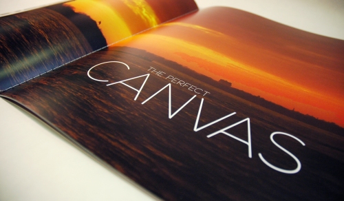
Typography in Street Art

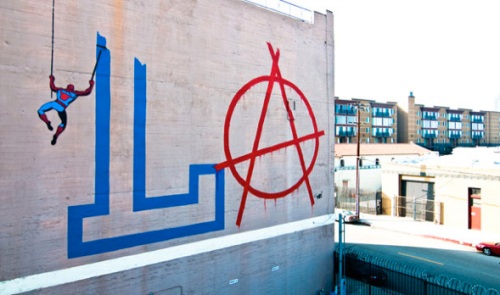
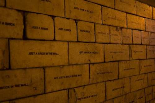
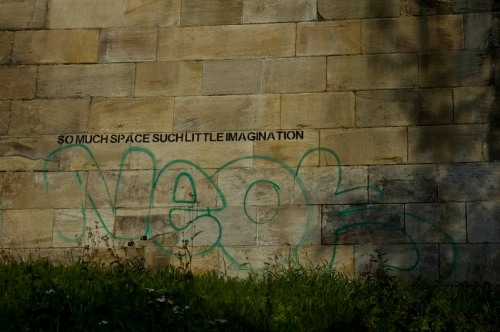
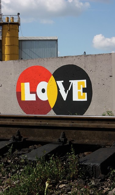
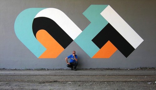
Sometimes the best design inspiration can stem from what we pass on the streets, painted and stenciled onto walls by our nocturnal and mysterious counterparts.  What we find is that street artists use many of the same spatial and graphic elements that designers use in creating their work.  Here are some examples of excellent typographic designs by famous street artists D*face, Mobstr, Aske, and CT, for inspiration.

D*face

D*face is most known for his logo-like stickers and cartoonish pictures, but shows he’s also capable of creating his own typography.


Mobstr

Mobstr’s pieces usually consist of simple, black stenciled quips — which only make his jokes funnier in their context.  He shows typography doesn’t need to be fancy to be clever.

Aske

Russian artist Aske (meaning “Ashes” in Norwegian) chose the name because he liked the shape and flow of the letters. He employs graphic elements similar to that seen in 1950s and 60s designs.

CT

Russian artist CT employs elements of movement, geometry, and optical illusions to create extremely bold and striking pieces, which appear more like logos than graffiti.